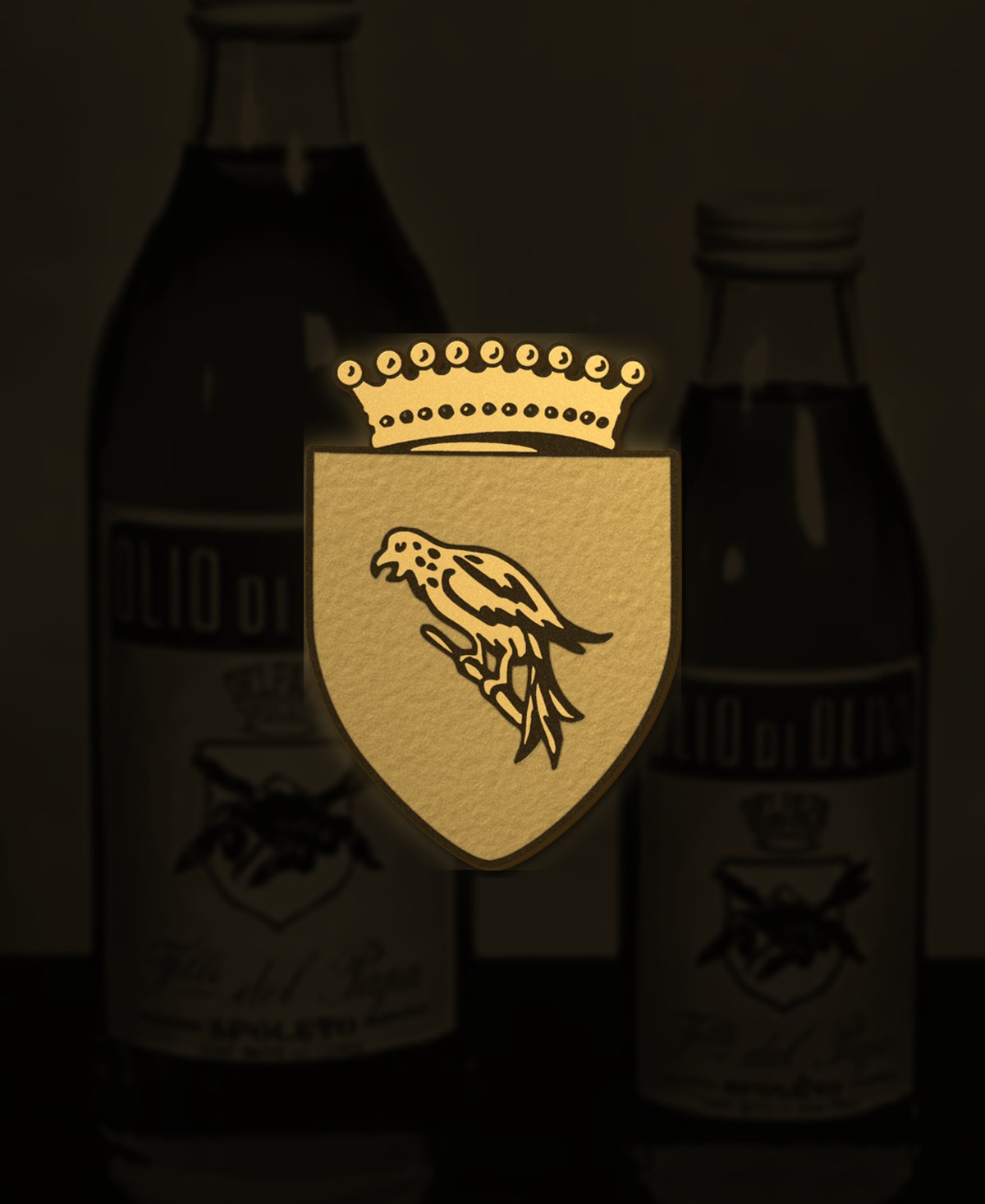
Look closely at any Del Papa bottle, from the 500 ml glass to the one-gallon tin, and you will find the same shield: a falcon on a blue field, under a crown, with the family name on a ribbon beneath. It has been there, essentially unchanged, since the bottles that read "Olio di Oliva, F.lli Del Papa, Spoleto" left the family's first mill.
The falcon
Umbria is falcon country; the bird of prey circling over the olive terraces is a sight every grower knows. On the shield it stands for the thing the family asked of itself from the beginning: a sharp eye. On the fruit, on the mill, on the lot. The crown above it is not nobility but the old heraldic shorthand for excellence, the best of its kind.
The blue
Blue is an unusual colour for an olive oil brand, where green and gold are the norm. It was chosen because it was unusual. On a shelf of green labels the blue field is still the fastest way to find the bottle, sixty years later, in Tokyo or New Jersey as in Spoleto.
Why it has not changed
Brands redraw their marks every decade or so. Ours has been redrawn once, to clean the lines for printing, and never redesigned. Three generations have signed the same shield, and each has understood that the mark is a promise made by the previous one. Change the oil and you can keep the crest; change the crest and you have told the customer the oil has changed.
Where to find it
On the label, in colour; on the black D.O.P. Umbria bottle, stamped in gold; on the cap seal; on the trade documents; on this site, in relief, in the top corner of every page. Six decades, one drawing.
The 1960s bottle with the ink shield is in the family archive and on the heritage page. Hold it next to a bottle from this year's harvest and the lineage is obvious.